Cursive P — Uppercase & Lowercase, Stroke Order
Cursive P is the letter P in joined handwriting: a capital P made of a straight stem and a round bowl, and a lowercase p that drops its stem below the baseline before closing a small bowl beside it. This page has the stroke order, printable practice sheets and the joins.
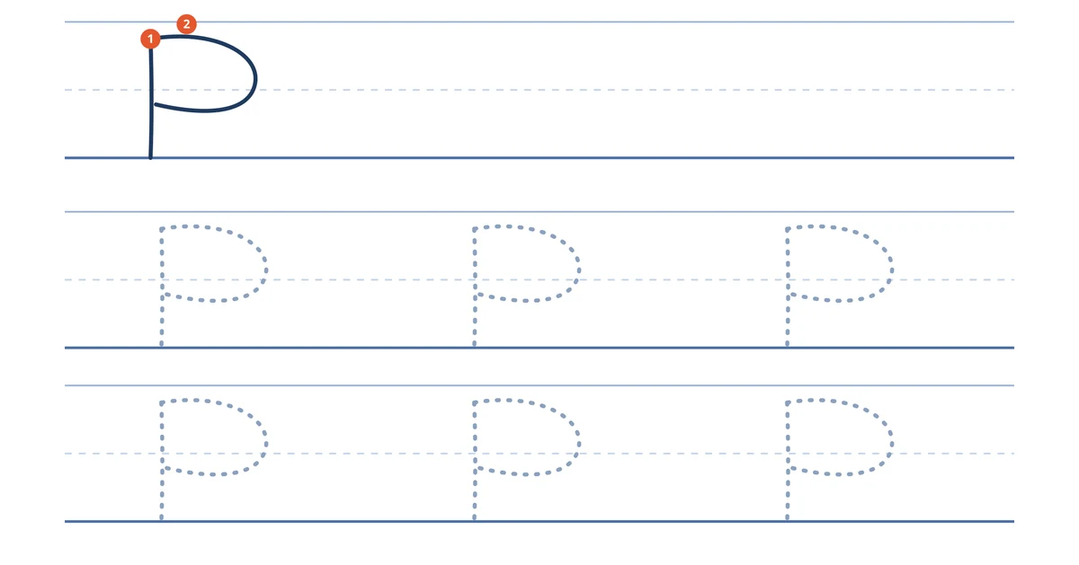
Download the A4 practice sheet (PDF) or the US Letter practice sheet (PDF). Each sheet shows the stroke order first, then rows of dotted letters to trace.
How to write a capital and a lowercase cursive p
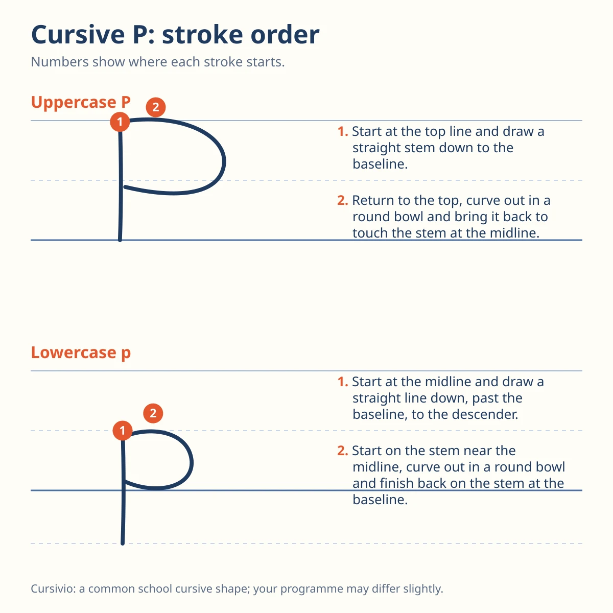
The chart shows both letters on guide lines: the solid top line, the dashed midline and the heavy baseline, plus a dashed line under the baseline where the lowercase stem ends. An orange number marks where each stroke begins. The shapes follow a common school cursive model rather than an official curriculum, so your school’s capital P may look a little different.
Uppercase P
- Start at the top line and draw a straight stem down to the baseline.
- Return to the top, curve out in a round bowl and bring it back to touch the stem at the midline.
Lowercase p
- Start at the midline and draw a straight line down, past the baseline, to the descender.
- Start on the stem near the midline, curve out in a round bowl and finish back on the stem at the baseline.
Lowercase p works on two levels: the bowl lives between the midline and the baseline, and the stem hangs below the baseline by about the height of the bowl.
Joining p to the next letter
The bowl of a lowercase p closes at the baseline, so the pen leaves from the bottom of the bowl and runs along the line into the next letter. The examples below show pa, pe and pi, then po, py and pu in a script font.
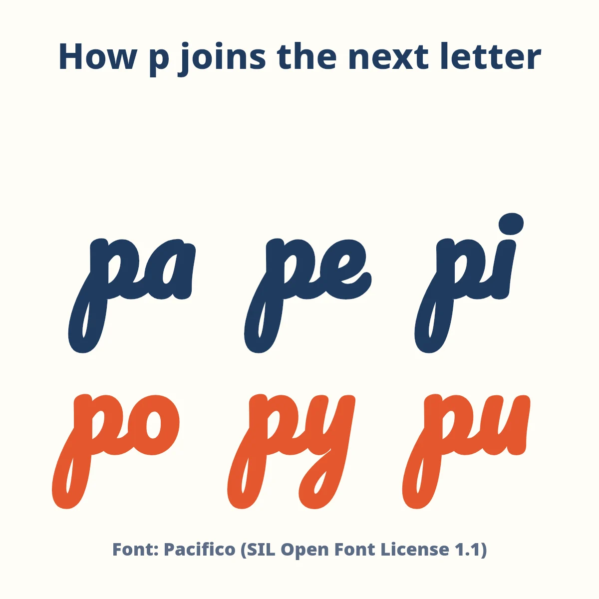
Font used for the examples: Pacifico, licensed under the SIL Open Font License 1.1. It is a display script and not a school handwriting model, so use it to see how the joins travel, not to copy letter shapes. More about fonts is on the font licenses page.
Three common mistakes with cursive p
- A stem that stops at the baseline. Without the descender the letter turns into a short b-like shape. Let the stem run below the line.
- A bowl that floats away from the stem. The bowl should touch the stem at the top and again at the baseline, or the p reads as an open curl.
- A bowl that climbs above the midline. Keep the bowl between the midline and the baseline, or the p starts to look like a small capital P in the middle of a word.
A short practice line
Trace the dotted letters first, then write three of your own on each line. A line to copy afterwards: patient pandas paint purple pears.
Questions about cursive p
How do you write a lowercase cursive p?
Start at the midline and draw a straight line down past the baseline. Then begin again on the stem near the midline, curve out in a round bowl and finish back on the stem at the baseline.
How is the capital cursive P different from the lowercase p?
The capital P is full height and sits on the baseline, with its bowl at the top. The lowercase p is half as tall above the line and its stem hangs below the baseline.
Does cursive p go below the line?
Yes. The stem of a lowercase cursive p is a descender and extends below the baseline. The capital P stays on the baseline.
Is this the official way to write cursive P?
No. It follows a common school cursive model, not an official curriculum. Check your school’s handwriting guide if it teaches a different capital P.
Looking for the rest of the letters? Go back to the Cursive alphabet chart and generator at Cursivio. Cursivio is run by the Cursivio editorial team; this page was last updated October 21, 2026.